Hang around the “Metsophere” long enough and you’ll meet some characters. Warren Fottrell, better known as “Warren Zvon” was one of the good ones.
You’ve probably seen Warren’s work out there; he’s the creator of hundreds of custom virtual baseball cards showcased on a website he called “Baseball Cards Like They Oughta Be” and a terrific Mets fan who professed to be among the throngs who, as teenager, stormed the Shea Stadium grounds following their 1973 playoff victory over Cincinnati. His cards reflected the Topps styles of his youth but covered a wide range of ballplayers, eras and events, frequently bleeding into his other interests in music, history and pop culture, many of which we also shared (Todd Rundgren and the Beatles, for example). His work had a zany, colorful, DIY energy to it; you’d never mistake it for a product of a polished studio, it was far too passionate, personal and funny for that.
I’d come across Warren first as a participant at Crane Pool, where a bunch of us have been good-naturedly enduring the Mets virtually for close to 20 years (please join us!). He was quick with a graphic for any occasion there and though never asked to, invariably created thoughtful and personal cards commemorating events like birthdays. I’m not even scratching the surface of the kind of things he could do. Though I never met him personally– I didn’t even know his last name until today–he was a good kind, wildly creative guy who I found out only this morning passed away earlier this month at age 62. He’d evidently been battling health issues he never talked much about.
Here’s to Warren and the rest of us who find creative ways to turn an often pointless and unsatisfying passion of following a sports team into a way of expressing themselves and enriching the experience for others. Warren’s work said all that and more.
PS– Guillermo Heredia is here. He wears No. 15. Let’s leave the 2020 Mets obituary for another day.
Marty Noble’s appreciation for baseball, and what it meant for fans like him, carried through to his writing in a way that no one else who wrote about the Mets ever quite achieved.
He wrote with a sense of historical perspective and an eye for detail, telling stories that others in his position simply would not or could not. He was a dogged reporter and a skillful writer whose musings on the seemingly unimportant minutia of the game — who occupied who’s old locker, and the progression of uniform numbers — took on more depth every time he wrote about them, becoming one of the chief inspirations for the creation of this project.
I was fortunate to have met Marty on a few occasions–first to solicit a blurb for the Mets by the Numbers book–and also in a number of lengthy phone conversations over the years that loaned his perspective on the team and its players for this and other writing projects. This included a dynamite interview I published in threeparts 11 years ago, and for an event in Manhattan that none among the small number of us attending fans will ever forget. While Marty wrote about uniform numbers in passing, and I do so more overtly, he completely understood what I was doing here and I will be forever grateful and humbled for his support.
Marty Noble passed away this week at age 70 and with him went a giant chronicler of Mets history. He was a Bronx-born Yankees fan who covered baseball for the Bergen Record in the 70s, Newsday for 24 years beginning in 1981 and finally MLB.com. He was opinionated and competitive, occasionally making the others on the beat look bad, and generating just the right amount of fear and respect from the subjects he wrote about. He brought a bit of himself to everything on the page including his last published piece, an astonishingly deep and heartfelt profile of Tom Seaver, another complicated legend who is also departing.
The Mets have had some uniform mishaps over the years, but nothing compared to the infamous Islanders rebrand of 1995, when the struggling hockey club abruptly cast away its classic logo and colors and reeled in an ocean motif highlighted by a cartoon fisherman crest.
Though meant to evoke local pride (and also, sell more merchandise) the move instead flopped with the team’s own fans and players; generated humiliating derision from opponents; and eventually, even the cash registers stopped ringing. The story of the worst branding initiative in sports history—and the associated leadership crises and on-ice failures that enabled and accompanied it—is deeply examined and entertainingly told in a terrific new book from Nick Hirshon called WE WANT FISH STICKS.
To the extent MBTN is focused on the branding message sent by blue-and-orange wearing athletes in New York, I caught up with Nick for the following (lightly edited) Q&A. His book is available at the usual outlets.
Jon Springer: Can you take me through the origins of this story?
Nick Hirshon: I’ve been interested in the Fisherman logo for years. When I was an undergrad at St. John’s University [2003-06] one of my classes was sports management and it was taught by a former general manager of the Nassau Coliseum. And he went into detail one day about the Fisherman logo and said he knew a guy at the Islanders who decided to go with the Fisherman logo and that stoked my interest in it.
As an Islanders fan myself, I’d been to so many games and seen the jersey on fans in the stands. And I became more curious wondering what the story was. In 2006, I wrote a story for the Hockey News about the history of the fisherman logo and I spoke to my former professor; I spoke to a guy named Pat Calabria who was an Islanders vice president at the time they changed to the Fisherman logo and is generally associated with making the decision, even though he alone did not make it.
Fast forward to 2013, and for my PhD at Ohio University we needed to write some sort of dissertation that was to be our signature project. I wanted to do something about the Islanders because they were my favorite team and I wanted something I’d be passionate about. But what could I go for here? What in their history hadn’t been told yet? A lot of people are interested in the Stanley Cups, but I wasn’t sure how interesting that is, besides the fact they won a lot, so I thought there’s got to be a more colorful story out there: What about the Fisherman logo?
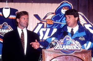
You’re taught in these historiography courses that history starts about 20 years ago. The Fisherman logo had been unveiled about 20 years before I embarked on this project: If it was something more recent, people might not be willing to talk about it, and we wouldn’t know how it turned out, or how it would be remembered. Once 20 years have passed, you have a good idea of the legacy. And for me it was good that it was just 20 years ago. So a lot of the people who were involved in the rebranding process were still alive, and they also were somewhat removed from the project, so they were willing to talk more freely and maybe be willing to criticize the people involved, whether it was the designers or Mike Milbury, the coach and general manager at the time.
Do you like the Fisherman jersey?
Kirk Muller wanted no part of it.
I never saw the problem with the logo itself. I do understand it looks a lot like the Gorton’s fisherman. It reminds me, and a lot of Islanders fans, of the 1990s. It has that look of the San Jose Sharks and Mighty Ducks logos that came out right before, and inspired the Fisherman logo. I’m drawn to the curiosity of it. This was a logo we can’t talk about, it is something that was around only for a couple of years and it was part of history that got whitewashed.
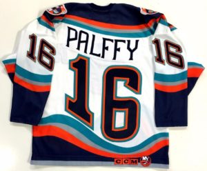
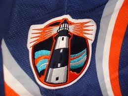
I also like the idea of what it represents. The Islanders don’t play in New York City: They wanted to differentiate themselves from the Rangers. There are distinctions between Long Island and New York. The ocean, the beach, the maritime culture, and the fishermen. And I like that with this jersey they were trying to do all of that. It wasn’t just the logo; it was the wavy numbers on the back that were supposed to represent ocean waves, and the lighthouse logo on the shoulder, which is one of my favorite logos ever. I wish they had made that the main crest.
I’m in agreement with you there. The Fisherman jersey in my mind has crossed the line in a way similar to the Mercury Mets jersey: The fans hated it so much they eventually became fond of it. It was so bad it was good.
Howie was there for both the reviled Islanders rebrand and the Mets one-night relocation to planet Mercury
There’s that same quality. Even if it was just one game, people remember the Mercury Mets because it was so bizarre. It reminds me of 1999, when I became a Mets fan, and that was a really great season for them. I vividly remember the Mercury Mets jersey because it was part of my initiation to Mets fandom. I vaguely remember Orel Hershiser wearing it. That’s the fondness people have for these things. If you look at it aesthetically, maybe if you’re a top-notch designer, you think this is silly. But if you’re going for a nostalgic point of a view and an emotional point of view, where I think fans are coming from, then you are going to be kinder to something that might not have been a Versace or Armani quality design.
The wavy numbers on the back of the jersey gave it an interesting look, but it interfered with the purpose of the jersey number which is to allow fans to identify players at a glance. Do you give much thought to the jersey numbers themselves? I thought it was interesting earlier this year when Lou Lamoriello unilaterally changed the jersey numbers of five or six players.
Lamoriello is known for wanting his players to wear low numbers. Josh Ho-Sang is one of the Islanders’ top players and had to change his number from 66 to 26. That caused a stir among a number of Islanders fans. As far as the waviness of the numbers on the jerseys, I didn’t give it a lot of thought. It just became another way for fans to mock the jersey. They could say, “it makes us seasick.”
“Seasick” numerology
It made for a disjointed look depending on what number you wore. If you have a number 1 and its bunched together in a wave, maybe it doesn’t look so bad, but if was a 6 or 9 or a number with contours to it, it made it weird on the back of the jersey.
To me I just embrace it all as part of this experiment. It was different. In my time as an Islander fan they’ve never done anything different with their main logo. There’s been some background changes and done different things with stripes, but they really haven’t done anything bold. And I like that with this jersey, they were really trying something different. OK, it failed, but I want to give them a little bit of credit for trying something. And I hate that because of this flop, the Islanders won’t do anything dramatic anymore. And it seems like they’re stuck with that one logo, and even their quote-unquote secondary logo is just pulling the ‘NY’ off the original logo.
Secondary logo that could have been primary
To me, the lighthouse is much more of Long Island type design. Whereas the Fisherman is something you might associate with parts of the Island, everybody on Long Island can relate to a lighthouse. Everybody goes to the beach and has seen them.
The Q&A you do with the designer in the book was interesting. He made a point that he doesn’t really like the classic Islanders logo.
I was startled by that, because for me and most Islander fans, that’s something sacrilegious. That’s what they wore when they won the Stanley Cup! That’s the logo that’s been there since the birth of franchise and I feel a real identity with it. I was an Islanders fan in Rangers country and had them knock me for it, so I became very loyal to it. I view it as a depiction of my identity as a fan.
But he said he didn’t like the lettering and other stuff, and the whole thing was a 1970s look. And the logo was done on short notice. Depending on which story you believe, it was about three days. Someone was told on a Thursday night we need to have a logo by Monday morning for a press conference. It was done before this modern era with focus groups and testing.
It goes to a larger point whether you make fun of the fisherman or the Nyisles the mascot or other aspects of the rebrand, it’s really all subjective. We might say this logo is clearly better, but is it really? The people I spoke to for the book who were pure design people all said the fisherman logo was better than the original Islanders logo. It’s all the memories coming to it though. It’s not all design 101.
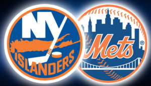
It’s fairly obvious to me how closely the Islanders logo adheres to the same ideals as the Mets logo. It’s a circle, it’s the same colors, it’s representative of the area, whether its bridges or buildings or the island itself. One’s got baseball stitches and the other’s got a hockey stick.
So how did you get the book sold? One of the truisms in sports publishing is that books about teams that struggle don’t do all that well.
Hockey books in general don’t sell well, unless its riding a famous player. Wayne Gretzky can sell his book, but will Nick Hirshon sell his? Part of my feeling was this was a very colorful, interesting story. So my idea was let’s not just sell it to this small niche of Islanders fans who remember 1995 but I think you can be someone who never went to an Islanders game and still appreciate the zany stories about Mike Milbury spitting at his players and John Spano coming in posing as a billionaire who will pump all this money into the team but it turns out he’s a con artist. You don’t need to be a true hockey fan to appreciate that.
I tried to make that a part of a part of the pitch from the beginning, so it wasn’t like, I’m a guy from Long Island writing about my favorite team. What the publishers kept asking was, “What’s significant about this?’” So I really had to establish why I thought this was the worst sports branding failure ever, and if you look at everything, they went through more in 28 months than most teams go through in 28 years. I also think University presses in particular are kinder to sports titles that might not do very well in terms of sales, but are stories worth telling and are worth getting out in the market.
As someone who was not very well versed in Islander history I was shocked just based on your descriptions of Milbury that he lasted even one year. And it’s easy to make the connection that the wackiness of the branding initiative is a match for the dysfunction in the front office and ownership.
Milbury didn’t leave the team until 2007. And that’s kind of insane when you consider the comments he made to the media, the terrible trades, clashing with so many players he sent away or disparaged. It’s unbelievable that someone like that could last so long especially in the New York market which is associated with high rates of turnover.
I think it was a combination of factors. Part of it was being out on Long Island and away from the New York spotlight. A general manager of the Mets or the Yankees couldn’t get away with what Milbury did. It was also before social media where people couldn’t band together to build a movement like they can today on Twitter and Facebook. Also, the ownership kept changing so there was no way to hold someone like Mike Milbury to account. Every new owner felt obligated to give him a chance. He was a hockey lifer and he was very charming and persuasive.
Were you able to reach Milbury as part of your research?
I tried, but I got a no from NBC Sports, where he’s an analyst now. I tried every single person I could who was involved in the rebrand: every player, the coaches, broadcasters and designers. I feel like you owe it to people who might not be viewed positively in your work to have a say. And that went for everyone, John Spano, and Kirk Muller, who was traded to the Islanders but didn’t report. But everything I say about them were from primary sources—Newsday, the New York Times.
I heard you mention casually you’d be interested in a Mets book. What would you write about?
I don’t know. I’m still trying to get the promotion for this one done. And doing the book is so much work, so much intellectual energy doing the research and the interviews. It’s all very daunting. I might be interested in the 1999 season which was my first as a Mets fan, but there’s probably people who are out there who know this more than me or are already working on it.
Quick reminder that the all-new, totally updated METS BY THE NUMBERS hits physical and virtual bookstores any day now, and we’re kicking off the festivities officially on Tuesday, June 14 with a reading, Q&A and book signing at Word Books, conveniently located near MBTN Headquarters in Greenpoint, Brooklyn. Word is located at the corner of Franklin & Milton streets — a short walk from the Greenpoint Ave. stop on the G train.
The event starts at 7 p.m. NBC Sports and Rotoworld’s D.J. Short will host, and guests include yours truly along with Greg Prince, author of the magnificent Faith & Fear in Flushing blog and the newly published fan chronicle of the 2015 season, AMAZIN AGAIN. We’ll have beer and Crackerjacks on hand and plans to head to a local watering hole to catch the Mets on TV afterward.
MBTN the book, again with contributions from Matthew Silverman, has been completely updated from the first edition which published in 2008, with details and history of more than 300 new players, all new photos, stats and sidebars including a history of the Mets uniform. Order now and get it in time for Father’s Day. Order extra ones in case it rains.
Hey, how about a big hand for returning hero Eric Campbell, who got the “lucky dog” promo for today’s double-dip in Pittsburgh? No? How about congratulating Rene Rivera for seemingly wrestling the No. 1 catching duties from struggling (again) Kevin Plawecki? New third baseman Wilmer Flores? New center field stud Alejando De Aza? Summer’s getting warm.
Well, the Internet debut of “New York Mets” (aka ‘We Want a Hit’) as posted below has made a small splash that we hope was heard out in Flushing but you never know with these Mets. In the story recounted at UniWatch, I was in the process of making a kind of Internet mix tape at the wonderful streaming site Rdio.com featuring artists who were also Mets fans.
Probably my favorite of these are the Hoodoo Gurus, the zany garage-pop rockers from Australia. As described in this interview by Zisk Magazine, Dave Faulkner, the Gurus’ singer, founder and songwriter, is a big fan of the orange-and-blue, having lived for a time in New York in the mid-1980s, where the energy and success of the Mets must have been a major source of inspiration for someone who’s talent was rocking. Posted below is the video for “What’s My Scene” from the Gurus’ 1987 album Blow Your Cool. Faulkner has remarked this is one of his favorite compositions “because it has two choruses when only one is necessary.” I like the video for the costume change at 2:47 and how it gets me pumped up from the very start. Thanks, Gurus, for being on our side.
By the way, be sure to check out the recent post on UniWatch revealing the first wearer of the Mets jersey: Don Zimmer.
I keep getting delayed in my attempt to write a season preview, a book review and a few other things but I dropped everything today when I heard this song for the first time. The artist is The Duke of Iron, also a new name to me, but apparently not to New York area Calypso fans in the 1940s, 50s and 60s. In celebrating we fans’ love of the team in spite of its foibles, I thought the Duke aka Cecil Anderson, who died in 1968) captured the spirit perfectly, as does the sound.
I was so inspired to share, I downloaded the song tonight and whipped up the accompanying video from stuff I had lying around. Enjoy!
Yes, come on in. We got to do a sports movie and I was wondering what you can get out of this. (tosses book onto the desk)
Faith and Fear in Flushing, by Greg W. Prince?
That’s the one.
Terrific book, sir, I’ve read it myself. And I…
They say it’s like ‘Fever Pitch’
That’s a fine comparison, Sir. Hornby and Prince are both outstanding writers whose works examine how a passion for a sports team becomes an inextricable part of who we are.
Hornby? Who the hell is Hornby? I’m talking about Drew Barrymore and Jimmy Kimmel.
Jimmy Fallon, Sir.
Whatever. Can we get Ben Affleck to play the lead?
Of Greg? I get more of a Paul Gamatti vibe…
We’re not going for Academy Awards here, son. We’re making a sports movie. And get Matt Damon to play his sidekick, Jason. ‘Lethal Weapon’ meets ‘Bull Durham’ I like it.
Well, boss, this is more of a love story.
Then get Drew Barrymore to play the girl.
I’ll call her agent.
And write in a little more drama. Have him have to win her from a Yankee fan. Or maybe from the Matt Damon guy. That’s the kind of spice this picture needs.
But Sir, you don’t understand. It was love at first sight between these two. In some ways, it mirrors the burgeoning relationship between the boy and his team, one that continues to this day.
She doesn’t have to compete for his love with the team?
Nope. It’s about devotion in good times and bad. It’s about what it feel like to be uplifted in 1986 and to bear witness to 1993, on 15 separate occasions.
Well then who’s the bad guy?
Oh, there’s lot of them, Sir. There’s Cesar Cedeno, M. Donald Grant, Benji Molina, Joe Grahe, Keith Lockhart … Page 157 is full of villains from the 1988 postseason alone and it pointedly doesn’t even include Mike Scioscia.
So this Scioscia fellow is innocent?
No, guilty as sin, Sir. It’s just one of many instances in this book where even hard-core fans will be reminded of how much more there were to the stories we all experienced than what may remain in popular memory. This is the testimony of a writer who has seen much, and forgotten little. Quite remarkable.
Yes, yes. But these bad guys? They all get it during the Big Game at the end, don’t they?
No sir. This is a story of the Mets. They’ve won the Big Game quite infrequently, as a matter of fact.
So it’s a tearjerker?
Certainly, some is. It reminds us that baseball, like life, often is a hard thing to endure. We might see ourselves as the awkward child who humiliates himself in a chance meeting with his hero — or the awkward adult whose Mets gear draws idiotic responses in the supermarket. And the story of a loved one with whom we’ve had complicated relationship dying of a terrible disease? Yeah, that one just might hit home. Thanks to the Mets, we all know what it feels like to look at a called strike 3.
Maudlin don’t sell popcorn, kid. Punch it up some.
Don’t need to Sir. It’s actually quite funny throughout. I particularly enjoyed the lighthearted but vicious gutting of Yankee fans in Chapter 23. I’ve taken it upon myself to contact the agent for Stuttering John Melendez.
I see. So how does it end?
They lose the Big Game – and for the third year in a row. Only, and I believe this is the central point, we don’t have to feel bad about ourselves because of it. And we needn’t be ashamed, because that’s what being a fan is all about. This is a story about loving the endings, some happier than others. It’s about being a Met fan. It’s about us.
(Summer 2010)
BEN AFFLECK DREW BARRYMORE PRINCE OF FLUSHING MATT DAMON PAUL GAMATTI and JOHN MELENDEZ as ‘THE UNCLEVER TOOL’ BASED ON THE MEMOIR ‘FAITH & FEAR IN FLUSHING’ BY GREG W. PRINCE
That’s a request, not a rhetorical question. As many of the readers here know, Greg W. Prince, who co-authors the outstanding Mets blog Faith & Fear in Flushing, has come out with a new book, also called Faith & Fear in Flushing and aptly subtitled An Intense Personal History of the Mets.
I will contribute a full reveiw when I’m finished reading it (I’m up to 1987 now, congratulations on meeting your wife, Greg) but thought now would be a good time to replay my explosive two-part interview with Greg that ran in this space last year. I was way out ahead of the market in declaring Greg a Big Shot then.
I had a fair amount of self-interest in doing this: In addition to pushing my own book, I was also hoping to understand how the heck he does it. The answer: He just does.
I consider it good news that Freddy Garcia has agreed to extended spring training and/or a minor league assignment. He obviously wasn’t pitching up to his standards, but perhaps at some point he will, and with the kinds of starts the Mets pitchers have been turning in lately, depth is going to be an issue over the course of a long season. Valerio de los Santos was released and Rule 5er Rocky Cherry — I was rooting for that guy — went and signed with Boston.
* * *
Thanks to those who showed up my chat last night in Roslyn; and to Victor and Rosemary for helping to set it up; and to my sister Jennifer for putting me in touch with them.
Welcome back, Ryan Church. The brain-damaged Mets right fielder returned Friday after a lengthy absense while superfluous catcher Robinson Cancel was sent back down to AAA. A more difficult, Obama-picks-a-running-mate type question faces the Mets on Saturday, when unpopular second baseman Luis Castillo is expected to return from an extended break during which he was barely missed.
To be honest the solution ought to be clear if painful —Argenis Reyes for all his good press isn’t the kind of hitter you couldn’t do without for a few days and to my knowledge only plays second base, so Castillo is probably an upgrade. Castillo in fact makes fewer outs than either Reyes or Damion Easley, and if actually and finally healthy, then he’s the player they probably ought to have out there. A strong offensive showing out of the gate is essential though.
If Reyes won’t go down you wonder how seriously they’re ready to consider Duaner Sanchez who clearly isn’t the same as he once was, while Luis Ayala is (what he was once but wasn’t recently).
Met-Lovin’ Big Shot George Thorogood is a guest on this week’s episode of Mets Weekly on SNY, airing at 12:30 p.m. Saturday. The SNY people pursued Lonesome George as a profile subject after seeing the interview published here.
 He wrote with a sense of historical perspective and an eye for detail, telling stories that others in his position simply would not or could not. He was a dogged reporter and a skillful writer whose musings on the seemingly unimportant minutia of the game — who occupied who’s old locker, and the progression of uniform numbers — took on more depth every time he wrote about them, becoming one of the chief inspirations for the creation of this project.
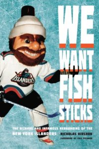 The Mets have had some uniform mishaps over the years, but nothing compared to the infamous Islanders rebrand of 1995, when the struggling hockey club abruptly cast away its classic logo and colors and reeled in an ocean motif highlighted by a cartoon fisherman crest.
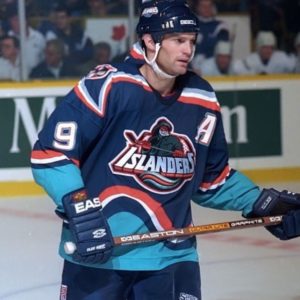
 Welcome back,