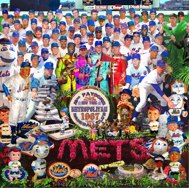
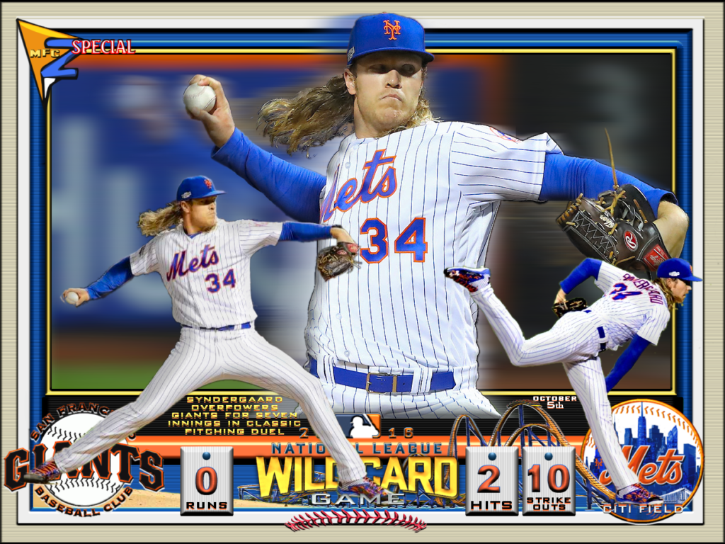
Hang around the “Metsophere” long enough and you’ll meet some characters. Warren Fottrell, better known as “Warren Zvon” was one of the good ones.
You’ve probably seen Warren’s work out there; he’s the creator of hundreds of custom virtual baseball cards showcased on a website he called “Baseball Cards Like They Oughta Be” and a terrific Mets fan who professed to be among the throngs who, as teenager, stormed the Shea Stadium grounds following their 1973 playoff victory over Cincinnati. His cards reflected the Topps styles of his youth but covered a wide range of ballplayers, eras and events, frequently bleeding into his other interests in music, history and pop culture, many of which we also shared (Todd Rundgren and the Beatles, for example). His work had a zany, colorful, DIY energy to it; you’d never mistake it for a product of a polished studio, it was far too passionate, personal and funny for that.
I’d come across Warren first as a participant at Crane Pool, where a bunch of us have been good-naturedly enduring the Mets virtually for close to 20 years (please join us!). He was quick with a graphic for any occasion there and though never asked to, invariably created thoughtful and personal cards commemorating events like birthdays. I’m not even scratching the surface of the kind of things he could do. Though I never met him personally– I didn’t even know his last name until today–he was a good kind, wildly creative guy who I found out only this morning passed away earlier this month at age 62. He’d evidently been battling health issues he never talked much about.
Here’s to Warren and the rest of us who find creative ways to turn an often pointless and unsatisfying passion of following a sports team into a way of expressing themselves and enriching the experience for others. Warren’s work said all that and more.
PS– Guillermo Heredia is here. He wears No. 15. Let’s leave the 2020 Mets obituary for another day.
You may have seen Bobby Valentine do a spirited performance of “Meet the Mets recently. I’m not sure but that may have inspired this guy who played the woodwinds and brass in a zoom show.
Next thing I know my musician friend Kenny “tags” me in a #MeetTheMetsChallenge only this one has a COVID-19 charity associated. So while we suffer through a baseballess baseball season and with the world needing a lot more support for treatment and a cure than it’s getting, I got some help from my wife and son and performed the Subterranean Homesick Blues inspired version below and made a donation of Relief International, which isn’t just Satoru Komiyama’s job description but a charity. Consider yourself challenged!
As disappointed as we all are to learn the start of the baseball season has been delayed as part of the economic wreckage of incompetent U.S. preparedness for the coronavirus, perhaps there’s a silver lining in not immediately experiencing how dumb it’s going to be when new rules requiring relief pitchers throw to at least three batters takes effect. And the March 26 opening date seemed obscenely early anyway. I don’t often bother to show up in Flushing until May, given that place is guaranteed to be 20 degrees colder and twice as damp as anywhere else in the five boroughs, but let’s hope they get it going by then.
How are we going to pass the time though? I’d been suffering through the Islanders season and now that’s done too. So we’re rewatching The Wire on the stream, and reading some books.
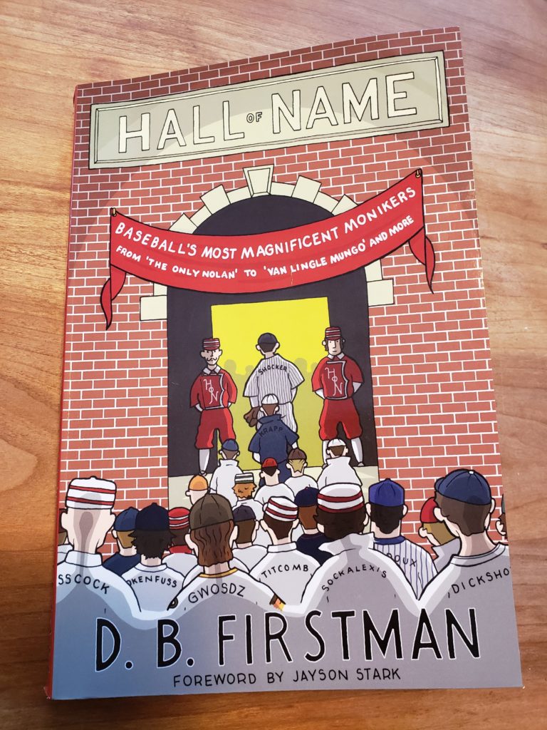
Around here we care primarily about the number on the back of the jersey but much of what needs to be said about the letters above them is addressed with wit, insight and just the right mix of respect and humor in HALL OF NAME, a new book coming out any day now from D.B. Firstman.
I’ve known D.B. primarily through SABR and the Twitterverse for some time now, and they were gracious to offer an early copy, which I’d been eating piecemeal for a few weeks.
That’s in fact one of the cool things about this book: You can open it to any of its 312 pages and find something fun and interesting. The book includes short biographies, trivial facts, anagrams and vague sound-alikes for 100 of baseball’s “most magnificent monikers” from Boof Bonzer to Coco Crisp to Joe Zdeb.
Even more precisely than numbers, D.B. notes, names lend a uniqueness to the game’s characters that’s part of the fun; but what I enjoyed the most was the revelation of a little bit more than just the stats accompanying those names that would make you briefly pause and admire while thumbing through the Baseball Encyclopedia (Rivington Bisland, Jennings Poindexter, Orval Overall); uncommon commons revealed in a pack of Topps cards (Mark Lemongello, Greg Legg, Biff Pocoroba); or references that never fail to elicit a giggle (Johnny Dickshot, Rusty Kuntz, and Pete LaCock, the latter all lovingly written up in a section helpfully called DIRTY NAMES DONE DIRT CHEAP).
There’s a little Met content too, with J.J. Putz, Lastings Milledge, Angel Pagan, Razor Shines, Ambiorix Burgos and Xavier Nady among those featured.
You’re stuck at home with no baseball? Go out and get a copy or have your bookstore deliver one, like I said it’ll be out any day now. And in honor of the book’s publishing, here’s my list of the Mets All-Time Name Team. They may not win much, but you’ll never forget them:
1B: Marv Throneberry
2B: Chin-lung Hu
3B: Pumpsie Green
SS: Adeiny Hechavaria
OF: Darryl Strawberry, Don Hahn, Prentice Redman
C: Greg Goosen, Taylor Teagarden
P: Wally Whitehurst, Ken MacKenzie, Vinegar Bend Mizell, Patrick Strange, Bartolome Fortunato, Roadblock Jones, Al Schmelz
How are you going to make it through? Who makes your all-name club?
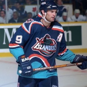
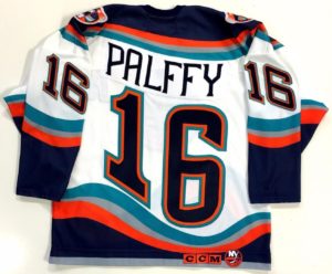
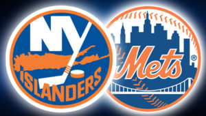
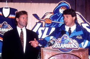
The Mets have had some uniform mishaps over the years, but nothing compared to the infamous Islanders rebrand of 1995, when the struggling hockey club abruptly cast away its classic logo and colors and reeled in an ocean motif highlighted by a cartoon fisherman crest.
Though meant to evoke local pride (and also, sell more merchandise) the move instead flopped with the team’s own fans and players; generated humiliating derision from opponents; and eventually, even the cash registers stopped ringing. The story of the worst branding initiative in sports history—and the associated leadership crises and on-ice failures that enabled and accompanied it—is deeply examined and entertainingly told in a terrific new book from Nick Hirshon called WE WANT FISH STICKS.
To the extent MBTN is focused on the branding message sent by blue-and-orange wearing athletes in New York, I caught up with Nick for the following (lightly edited) Q&A. His book is available at the usual outlets.
Jon Springer: Can you take me through the origins of this story?
Nick Hirshon: I’ve been interested in the Fisherman logo for years. When I was an undergrad at St. John’s University [2003-06] one of my classes was sports management and it was taught by a former general manager of the Nassau Coliseum. And he went into detail one day about the Fisherman logo and said he knew a guy at the Islanders who decided to go with the Fisherman logo and that stoked my interest in it.
As an Islanders fan myself, I’d been to so many games and seen the jersey on fans in the stands. And I became more curious wondering what the story was. In 2006, I wrote a story for the Hockey News about the history of the fisherman logo and I spoke to my former professor; I spoke to a guy named Pat Calabria who was an Islanders vice president at the time they changed to the Fisherman logo and is generally associated with making the decision, even though he alone did not make it.
Fast forward to 2013, and for my PhD at Ohio University we needed to write some sort of dissertation that was to be our signature project. I wanted to do something about the Islanders because they were my favorite team and I wanted something I’d be passionate about. But what could I go for here? What in their history hadn’t been told yet? A lot of people are interested in the Stanley Cups, but I wasn’t sure how interesting that is, besides the fact they won a lot, so I thought there’s got to be a more colorful story out there: What about the Fisherman logo?
You’re taught in these historiography courses that history starts about 20 years ago. The Fisherman logo had been unveiled about 20 years before I embarked on this project: If it was something more recent, people might not be willing to talk about it, and we wouldn’t know how it turned out, or how it would be remembered. Once 20 years have passed, you have a good idea of the legacy. And for me it was good that it was just 20 years ago. So a lot of the people who were involved in the rebranding process were still alive, and they also were somewhat removed from the project, so they were willing to talk more freely and maybe be willing to criticize the people involved, whether it was the designers or Mike Milbury, the coach and general manager at the time.
Do you like the Fisherman jersey?
Kirk Muller wanted no part of it.
I never saw the problem with the logo itself. I do understand it looks a lot like the Gorton’s fisherman. It reminds me, and a lot of Islanders fans, of the 1990s. It has that look of the San Jose Sharks and Mighty Ducks logos that came out right before, and inspired the Fisherman logo. I’m drawn to the curiosity of it. This was a logo we can’t talk about, it is something that was around only for a couple of years and it was part of history that got whitewashed.
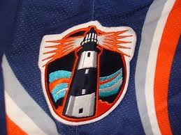
I also like the idea of what it represents. The Islanders don’t play in New York City: They wanted to differentiate themselves from the Rangers. There are distinctions between Long Island and New York. The ocean, the beach, the maritime culture, and the fishermen. And I like that with this jersey they were trying to do all of that. It wasn’t just the logo; it was the wavy numbers on the back that were supposed to represent ocean waves, and the lighthouse logo on the shoulder, which is one of my favorite logos ever. I wish they had made that the main crest.
I’m in agreement with you there. The Fisherman jersey in my mind has crossed the line in a way similar to the Mercury Mets jersey: The fans hated it so much they eventually became fond of it. It was so bad it was good.
Howie was there for both the reviled Islanders rebrand and the Mets one-night relocation to planet Mercury
There’s that same quality. Even if it was just one game, people remember the Mercury Mets because it was so bizarre. It reminds me of 1999, when I became a Mets fan, and that was a really great season for them. I vividly remember the Mercury Mets jersey because it was part of my initiation to Mets fandom. I vaguely remember Orel Hershiser wearing it. That’s the fondness people have for these things. If you look at it aesthetically, maybe if you’re a top-notch designer, you think this is silly. But if you’re going for a nostalgic point of a view and an emotional point of view, where I think fans are coming from, then you are going to be kinder to something that might not have been a Versace or Armani quality design.
The wavy numbers on the back of the jersey gave it an interesting look, but it interfered with the purpose of the jersey number which is to allow fans to identify players at a glance. Do you give much thought to the jersey numbers themselves? I thought it was interesting earlier this year when Lou Lamoriello unilaterally changed the jersey numbers of five or six players.
Lamoriello is known for wanting his players to wear low numbers. Josh Ho-Sang is one of the Islanders’ top players and had to change his number from 66 to 26. That caused a stir among a number of Islanders fans. As far as the waviness of the numbers on the jerseys, I didn’t give it a lot of thought. It just became another way for fans to mock the jersey. They could say, “it makes us seasick.”
“Seasick” numerology
It made for a disjointed look depending on what number you wore. If you have a number 1 and its bunched together in a wave, maybe it doesn’t look so bad, but if was a 6 or 9 or a number with contours to it, it made it weird on the back of the jersey.
To me I just embrace it all as part of this experiment. It was different. In my time as an Islander fan they’ve never done anything different with their main logo. There’s been some background changes and done different things with stripes, but they really haven’t done anything bold. And I like that with this jersey, they were really trying something different. OK, it failed, but I want to give them a little bit of credit for trying something. And I hate that because of this flop, the Islanders won’t do anything dramatic anymore. And it seems like they’re stuck with that one logo, and even their quote-unquote secondary logo is just pulling the ‘NY’ off the original logo.
Secondary logo that could have been primary
To me, the lighthouse is much more of Long Island type design. Whereas the Fisherman is something you might associate with parts of the Island, everybody on Long Island can relate to a lighthouse. Everybody goes to the beach and has seen them.
The Q&A you do with the designer in the book was interesting. He made a point that he doesn’t really like the classic Islanders logo.
I was startled by that, because for me and most Islander fans, that’s something sacrilegious. That’s what they wore when they won the Stanley Cup! That’s the logo that’s been there since the birth of franchise and I feel a real identity with it. I was an Islanders fan in Rangers country and had them knock me for it, so I became very loyal to it. I view it as a depiction of my identity as a fan.
But he said he didn’t like the lettering and other stuff, and the whole thing was a 1970s look. And the logo was done on short notice. Depending on which story you believe, it was about three days. Someone was told on a Thursday night we need to have a logo by Monday morning for a press conference. It was done before this modern era with focus groups and testing.
It goes to a larger point whether you make fun of the fisherman or the Nyisles the mascot or other aspects of the rebrand, it’s really all subjective. We might say this logo is clearly better, but is it really? The people I spoke to for the book who were pure design people all said the fisherman logo was better than the original Islanders logo. It’s all the memories coming to it though. It’s not all design 101.
It’s fairly obvious to me how closely the Islanders logo adheres to the same ideals as the Mets logo. It’s a circle, it’s the same colors, it’s representative of the area, whether its bridges or buildings or the island itself. One’s got baseball stitches and the other’s got a hockey stick.
So how did you get the book sold? One of the truisms in sports publishing is that books about teams that struggle don’t do all that well.
Hockey books in general don’t sell well, unless its riding a famous player. Wayne Gretzky can sell his book, but will Nick Hirshon sell his? Part of my feeling was this was a very colorful, interesting story. So my idea was let’s not just sell it to this small niche of Islanders fans who remember 1995 but I think you can be someone who never went to an Islanders game and still appreciate the zany stories about Mike Milbury spitting at his players and John Spano coming in posing as a billionaire who will pump all this money into the team but it turns out he’s a con artist. You don’t need to be a true hockey fan to appreciate that.
I tried to make that a part of a part of the pitch from the beginning, so it wasn’t like, I’m a guy from Long Island writing about my favorite team. What the publishers kept asking was, “What’s significant about this?’” So I really had to establish why I thought this was the worst sports branding failure ever, and if you look at everything, they went through more in 28 months than most teams go through in 28 years. I also think University presses in particular are kinder to sports titles that might not do very well in terms of sales, but are stories worth telling and are worth getting out in the market.
As someone who was not very well versed in Islander history I was shocked just based on your descriptions of Milbury that he lasted even one year. And it’s easy to make the connection that the wackiness of the branding initiative is a match for the dysfunction in the front office and ownership.
Milbury didn’t leave the team until 2007. And that’s kind of insane when you consider the comments he made to the media, the terrible trades, clashing with so many players he sent away or disparaged. It’s unbelievable that someone like that could last so long especially in the New York market which is associated with high rates of turnover.
I think it was a combination of factors. Part of it was being out on Long Island and away from the New York spotlight. A general manager of the Mets or the Yankees couldn’t get away with what Milbury did. It was also before social media where people couldn’t band together to build a movement like they can today on Twitter and Facebook. Also, the ownership kept changing so there was no way to hold someone like Mike Milbury to account. Every new owner felt obligated to give him a chance. He was a hockey lifer and he was very charming and persuasive.
Were you able to reach Milbury as part of your research?
I tried, but I got a no from NBC Sports, where he’s an analyst now. I tried every single person I could who was involved in the rebrand: every player, the coaches, broadcasters and designers. I feel like you owe it to people who might not be viewed positively in your work to have a say. And that went for everyone, John Spano, and Kirk Muller, who was traded to the Islanders but didn’t report. But everything I say about them were from primary sources—Newsday, the New York Times.
I heard you mention casually you’d be interested in a Mets book. What would you write about?
I don’t know. I’m still trying to get the promotion for this one done. And doing the book is so much work, so much intellectual energy doing the research and the interviews. It’s all very daunting. I might be interested in the 1999 season which was my first as a Mets fan, but there’s probably people who are out there who know this more than me or are already working on it.
 How are we going to pass the time though? I’d been suffering through the Islanders season and now that’s done too. So we’re rewatching The Wire on the stream, and reading some books.
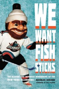 The Mets have had some uniform mishaps over the years, but nothing compared to the infamous Islanders rebrand of 1995, when the struggling hockey club abruptly cast away its classic logo and colors and reeled in an ocean motif highlighted by a cartoon fisherman crest.