You all know this by now. The Mets have been without a proper No. 8 for almost 25 years in anticipation of a ceremony so many desperately wanted but was never scheduled. I’ve said it often enough — Gary Carter doesn’t belong with those who’ve had their numbers retired by the Mets so let’s get No. 8 out there again. It’s no disrespect. It’s actually respect. Respect for the dignity of the franchise after it pretends to have had a history loaded with players so iconic and great and associated with the team and the city that they need to be honored in this way.
Well. let me say I like that Nick Morabito got No. 8 today. And it’s cool that AJ Ewing is wearing No. 9 when Brandon Nimmo is on the outskirts of what the Mets would now consider a retire-able uniform. Maybe something changed? Maybe they looked at themselves in the mirror. Maybe they realize that the best way forward isn’t to arrest the past in its tracks but set it free on the backs of the next generation. I love it I tell ya.
Oh shit, I just saw Matt’s comment below. They apparently “Torvee’d” this guy. Bullshit. Never mind
I’d like to take a second and welcome myself back, you almost lost me for good too but these young outfielder moves are exciting. Maybe they can give the next one 88 and say goodbye to the mistakes they shopped for over the offseason.
There’s nowhere to input the uni data anymore, unless someone out there wants to assemble a database that we can link here.
I can tell you, it was an Amazin’ Day. Went grocery shopping, took a nap and went to the gym. Then I came back and heard the reports from what was going on at CitiField.
New unis! New numbers!
Let’s start with the alternate blue away jersey. The amazin’ thing about this isn’t the resurrection of the 1987-style script or the black-home style outlined numerals (that will be hard to see) but that it’s a pullover. Same style and silly neckline as the Nationals’ alts. This would appear to supplant the blue away jersey they had been using, but infrequently. I preferred the version with the grey letters.
Will they pair this with grey pants? Blue? Orange?!? I’d like to see the latter.
Now to numbers. Brett Baty whose 22 went to Juan Soto, revealed he’d be wearing No. 7 this year. I can’t tell you how happy it makes me to see that number in circulation again — although 8 would better. Seven had been unissued since Marcus Stroman took it upon himself to shelve it in 2019.
Other numbers for new guys on the 40-man roster: Jose Siri wearing 19, which I believe is pulling even with 6 as the most-issued number in team history (I’ll check on that). Infielder Jared Young (who?) in 29; and Jose Azocar in 30.
The newly arriving pitchers: A.J. Minter 33; Clay Holmes 35; Frankie Montas 47 and Griffin Canning 55. Then there’s the fringey waiver claims and surprise bullpen candidates I don’t know well yet–Dylan Covey in 54; Justin Hagenman in 51; Kevin Herget in 57; and Austin Warren in 44.
I don’t need to tell you David Wright was an all-time Met great. Fielded his position well. Hit for power and average. Could take a walk. Clutch? You bet. Well spoken. Model citizen. Dad was a cop. Met stock through and through draft pick who grew up rooting for the Tides, never played for another team and acquired as a compensation draft pick for just the kind of fleeting mercenary he wasn’t, the one-and-done Mike Hampton. Tore up the team record books to lead all-time in hits, runs scored, plate appearances, doubles, walks, total bases and runs batted in. Got along great with the press. .296 batting average, same as Mike Piazza as a Met.
If they didn’t go and hang his No. 5 high up in left field next summer, all of the above things would still be true, and needn’t be forgotten, since Wright at the same time will be entering into the Mets Hall of Fame.
I don’t need to tell you, and neither does the retired number.
Don’t get me wrong. I think Wright is the perfect example of a player whose number should be retired, for all the reasons above. But numbskulls are already writing dumb articles about who should be next as though there’s a well of guys as accomplished as Wright out there in Mets history who somehow just haven’t gotten their due.
The sad truth of the matter is the Mets don’t have a great history when it comes to developing retirement-worthy ballplayers and no amount of number-retirement is going to fix that. So I’m calling for an end to number retirements, not just for the Mets, but as a thing. Find a more creative way to salute the accomplishments of these guys. Name a field after Gary Carter. Have the best rookie win the Dwight Gooden Award. And I’d much prefer a Darryl Strawberry statue by the right field gate than no more No. 18s. Wouldn’t anybody?
There’s rain in the forecast on Thursday and high winds expected on Friday, so if you’re crazy enough to consider Citi Field in March, please dress accordingly. (Oh, I see Thursday has been called already).
The Mets for their part will be wearing the ugly new uniforms designed for them by Nike. The nameplates are way too small (as is the new Bud Harrelson patch), and all of it is ironed on and not stitched like Abner Doubleday intended. Seriously I’d sooner see them return to no nameplates than participate in this farce. It just doesn’t look right.
It’s sort of the same with these Mets. I’m expecting they’ll be at or close to .500 this year. The starting pitching might hold together but might not. The lineup should put points on the board but there’s questions there too (Marte, Bader and McNeil; I think Baty has nowhere to go but up). And the bullpen is the bullpen. We also don’t know how Mendoza will manage managing.
Joining the Mets for the first time will be Zack Short in 21 (thanks guys for the updates), Harrison Bader (44), Joey Wendle (13), JD Martinez (28), and Tyrone Taylor (15). New pitchers: Jake Deikman (30); Adrian Houser (35); Jorge Lopez (52); Sean Manaea (59); Yohan Ramirez (46); Luis Severino (40); amd Michael Tonkin (51).
New staff: Carlos Mendoza (64); John Gibbons (68); Antoan Richardson (66); Mike Sarbaugh (88); and Jose Rosado (67). Sarbaugh was in 64 and took 88 when Mendoza moved up for JD Martinez.
So much for the Mets not screwing up the jersey-sponsor patch opportunity. It’s enough to desecrate the uniform itself with advertising; but to do so in the wrong color is inexcusable. The “white space” in the patch represents the allowable sponsor real estate on the sleeve but clearly doesn’t help the design, it’s an eyesore through and through and a tragic moment in Met uniform history.
On the bright side it looks like Francisco Alvarez will be here for the home opener ad Omar Narvaez lasted a week till needing the injured list. And just in– Alvarez has been issued No. 4 and the 50 he wore late last year. I don’t want to overstate it but this season seems teetering on the edge of going way wrong already.
The Mets made it official, reserving July 9 for a pregame ceremony during which they will remove No. 17 from circulation to honor the World Champion first baseman, Gold Glove winner, New Yorker and broadcaster Keith Hernandez.
Those who’ve been around these parts know I’ve always been somewhat of a small-hall guy when it comes to uni number retirement. I’d prefer to see them hang 17 on the back of a young player who looks like he could become something, but when the alternative is Mike Bordick, Jose Lima and David Newhan, it’s best to just leave it be. The club started the momentum by taking 36 out on behalf of Jerry Koosman–a justifiable decision, for sure, but one that came too late to have the meaning it might.
Keith by contrast grew into the honor. His career in New York was simply too short and lacking in meaningful counting stats to justify it alone; further complicating matters was that his similarly short-tenured co-captain, Gary Carter, had similar issues despite arriving at the Hall of Fame. Talented and indispensable teammates from Strawberry to Wilson to Backman to Gooden, made an argument that the best decision would have been to simply remove 86 from the available inventory but that ship has sailed as well.
To me, Hernandez’s honor will be about changing the other club’s bunting strategies, about game-winning RBI’s and about properly aligned racing stripes, but also about post-career Seinfeld appearances and the company he offers those of us sitting at home.
And while the lockout seems certain to threaten a timely start to the 2022 season when and if it begins the Mets will carry a new number on the field with them–60, to mark the anniversary of the team’s first season. The patch looks appropriate if not especially handsome. Let’s hope the team is the other way around.
Just as we feared, the Mets’ failure to capitalize on the graciousness of struggling divisional opponents early this season is turning the second half into a complete disaster.
Yeah there’s been key injuries but there’s plenty more blame to go around, including a passive posture at the trade deadline that’s already blown up in their faces, a teamwide hitting approach that simply looks awful, and a return to black uniforms that at some level, speaks to misplaced priorities and a poor sense of taste.
I’m not against mixing up things up sartorially, and acknowledge the sense of excitement and nostalgia that accompanies the black era, but to me this is another manifestation of a poor approach leading to missed opportunity. The problem with the black jerseys wasn’t that they were black, necessarily, but they were poorly designed. Try something different already: Hit against the shift. Take a strike down by a run in the 9th. Get a fashion expert to take another look at incorporating black without a clashy, busy, and depressing expression.
I’m cranky because I stayed up last night to watch these palookas finally do enough offensively to win (with some missed opportunity) only to see the bullpen cough up any chance. The team is infected somehow and begun to resemble Luis Rojas’s 2020 squad, which missed the playoffs in the easiest year ever to make the playoffs. This might be the second.
There’s now been a club record 60 guys on the roster this year. Sidearmer Jake Reed (who?) is the latest, wearing No. 52 (Nick Tropeano, we hardly knew ye). Reed came to us from the … (looks it up) Rays, who released him and was previously with the … Dodgers … and Angels … and Twins orgs.
Trevor Williams, collected in the ill-fated deadline day giveaway with the Cubs, in the meantime has been up and back and now back again, wearing 29 and reminding me of another Cubs-bred Met starter, Steve Trachsel and adding to our league-leading collection of Trevors. Travis Blankenorn (73) is back. Geoff Hartlieb (40) has been up and back. Patrick Mazeika (76) is even back (Tomas Nido is injured, because). What difference does it make?
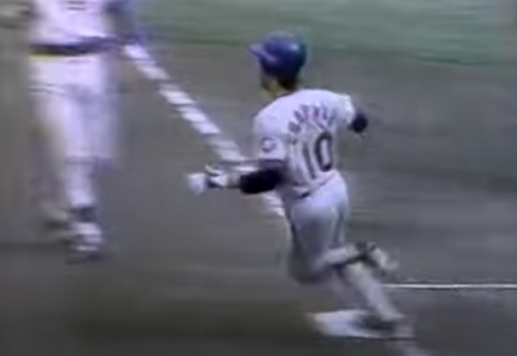
Just last night, Billy McKinney homered off Anthony Banda.
The most famous 61 since Roger Maris’ shot off future Met Jack Fisher has come gloriously back to life.
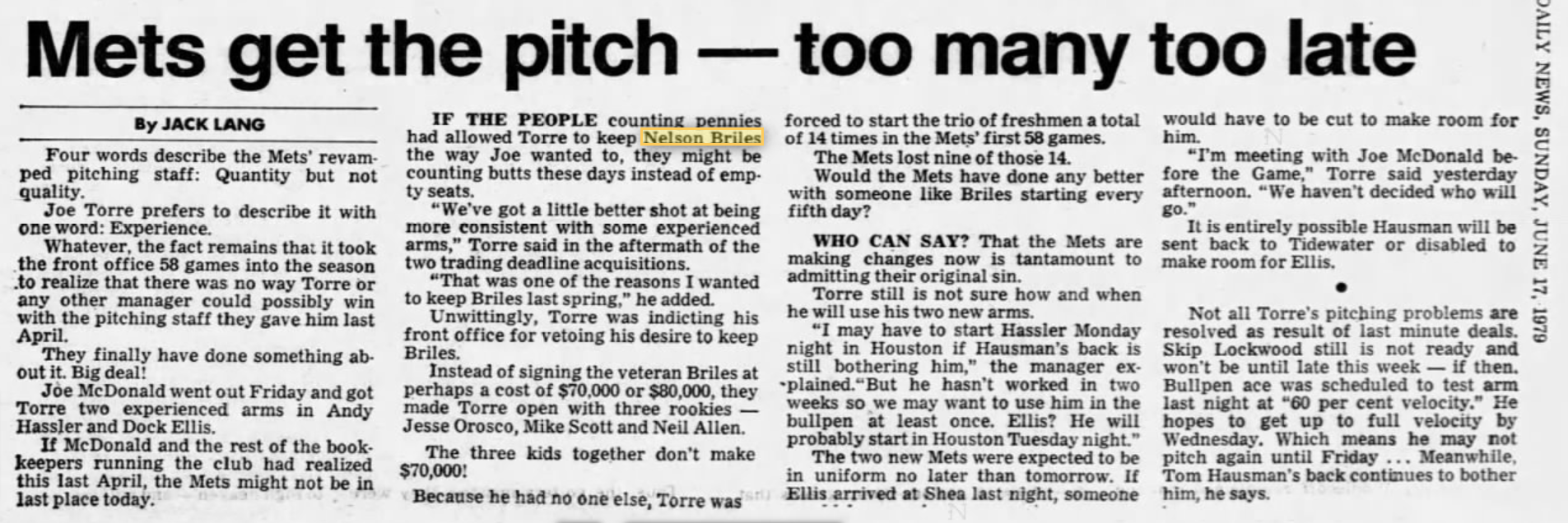
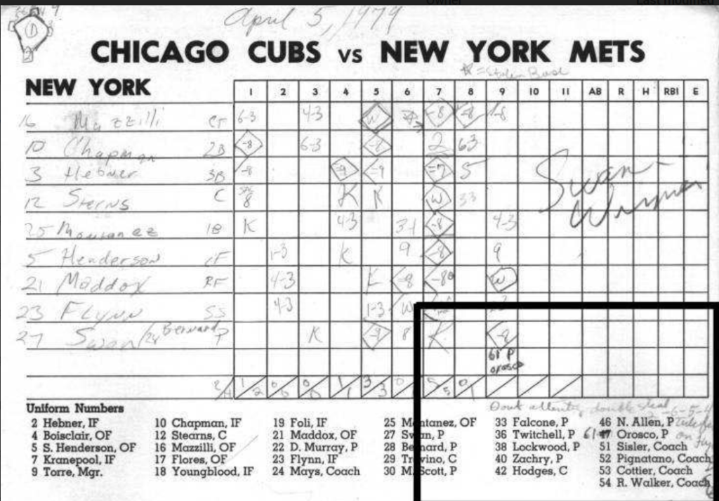
Just in, Met historian Dennis D’Agostino alerted me to a newly published Youtube of the entire WGN broadcast of 1979’s Opening Day Mets-Cubs game at Wrigley Field that included the major-league debut of the Mets’ Jesse Orosco. As readers of this site know this was an important historical moment not just because Orosco would go to make another 1,251 appearances–the most for a pitcher in baseball history–but that for the unusual circumstances under which he appeared: Wearing a jersey that bore No. 61, with no name on the back. Verifying this bit of odd history–Orosco made all of his subsequent appearances for the Mets wearing No. 47–and maintained that number for 23 years until a career-ending 8-game stretch with Minnesota when teammate Corey Koskie wore 47–was one of the landmark Holy Grails of this project.
Over the years and with the help of good people like like Dennis, my Cub fan friend Kasey Ignarski, who provided his own hand-scored scoresheet, and a third fan who provided video stills of the game, we nailed this. But I never saw the whole broadcast until yesterday. You will die when you hear Jack Brickhouse’s commentary at the 2:25:30 mark. Start here:
As previously relayed, that a 22-year-old Orosco even made the trip was something of a surprise it itself. The lefty was selected ahead of more accomplished contenders like Nelson Briles, due primarily to the austerity measures enacted as the ’79 club crawled to the finish line of the Payson-deRoulet Era as a destitute franchise. Its likely the club simply didn’t have the time or money to spring for a “proper” jersey (61 was outrageously high then) that wasn’t a spring training used jersey. ’79 was also the first year that Mets affixed names to jerseys but as shown they didn’t get around to all of them.
Lee Mazzilli also lacked a name on back–but Kelvin Chapman did not.Joe Torre preferred Briles to Orosco, Scott and Allen
Kasey Ignarski’s hand-written scorecard: The same data Jack Brickhouse had!
Tonight, ballplayers from Seattle to Miami and everywhere between will reflect upon the corpulent legacy that Mo Vaughn exhibited during his stint with the New York Mets in 2002 and 2003.
Mo Vaughn taught the Mets–and all of baseball really — what it meant to be a big acquisition, and how to face the dying days of one’s career without exerting too much energy. In his honor, ballplayers throughout MLB will don No. 42 — the same digits found on the back of Vaughn’s 3XL jersey.
Maurice Samuel Vaughn was born on Dec. 15, 1967 in Norwalk, Conn. and was drafted in the first round out of Seton Hall University by the Boston Red Sox in 1989. In time, Vaughn became a star first baseman for the Red Sox, winning AL MVP honors in 1995 behind a .300-39-126 season. After two additional top-5 MVP seasons in Boston, the hefty lefty signed a six-year, $80 million contract with the Angels.
In Anaheim, Vaughn piled up the home runs, RBIs and strikeouts like the Carnegie Deli sandwich artists would stack up sliced pastrami, corned beef, turkey and cheese on the Mo-Licious sandwich. But an injury to his his massive biceps requiring surgery cost Vaughn the entire 2001 season, and combined with a deteriorating relationship with the Angels front office, became just the sort of deeply discounted damaged goods the Mets under Steve Phillips could not resist shopping for.
The strenuous offseason remake only require the Mets involve themselves in a three-team 11-player trade shedding Todd Zeile, Benny Agbayani, Glendon Rusch and Lenny Harris (gaining back a poor-man’s Vaughn type in Jeromy Burnitz and the unforgettable Jeff D’Amico); trading another 5 guys to the Cleveland Indians for a past-his-prime Roberto Alomar; sign reserve-level outfielder Roger Cedeno to a 4-year contract; and ship overpaid Kevin Appier to Anaheim for Vaughn.
Led by Big Mo, the totally new and yet older and fatter 2002 Mets were the kind of massive disappointment legends are made of. Two years after making the World Series the club slid to a 75-86, 5th-place finish (for which the club blamed the manager. Of course!). And with a 35-year-old Vaughn back in 2003 (at least until his knees gave way in May) the club crashed through the 90-loss barrier.
On May 2 in Milwaukee, Vaughn started at first base, drew a walk in four plate appearances, and was replaced for defense by Tony Clark. He then went on the DL for knee surgery, never again returning to a Mets or MLB game. He missed his own Bobblehead Night scheduled the following week, but the Mets had more in mind: A rotunda in their new park to honor the man.
Tonight, we remember Big Mo.
*
I’m only joking as has come to be a tradition this time of year and mean not to take an iota of dignity from the memory of Jackie Robinson, whose influence was importance enough to Mo Vaughn to have beaten baseball to the punch in wearing it on his back. Vaughn was also a pretty good player. Hats off to him! And to Ron Hodges, and to Larry Elliot, and to Chuck Taylor, and to Chuck Taylor’s brother, Ron Taylor! And Butch Huskey and Roger McDowell. But most of all to Jackie Robinson.
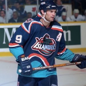
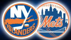
The Mets have had some uniform mishaps over the years, but nothing compared to the infamous Islanders rebrand of 1995, when the struggling hockey club abruptly cast away its classic logo and colors and reeled in an ocean motif highlighted by a cartoon fisherman crest.
Though meant to evoke local pride (and also, sell more merchandise) the move instead flopped with the team’s own fans and players; generated humiliating derision from opponents; and eventually, even the cash registers stopped ringing. The story of the worst branding initiative in sports history—and the associated leadership crises and on-ice failures that enabled and accompanied it—is deeply examined and entertainingly told in a terrific new book from Nick Hirshon called WE WANT FISH STICKS.
To the extent MBTN is focused on the branding message sent by blue-and-orange wearing athletes in New York, I caught up with Nick for the following (lightly edited) Q&A. His book is available at the usual outlets.
Jon Springer: Can you take me through the origins of this story?
Nick Hirshon: I’ve been interested in the Fisherman logo for years. When I was an undergrad at St. John’s University [2003-06] one of my classes was sports management and it was taught by a former general manager of the Nassau Coliseum. And he went into detail one day about the Fisherman logo and said he knew a guy at the Islanders who decided to go with the Fisherman logo and that stoked my interest in it.
As an Islanders fan myself, I’d been to so many games and seen the jersey on fans in the stands. And I became more curious wondering what the story was. In 2006, I wrote a story for the Hockey News about the history of the fisherman logo and I spoke to my former professor; I spoke to a guy named Pat Calabria who was an Islanders vice president at the time they changed to the Fisherman logo and is generally associated with making the decision, even though he alone did not make it.
Fast forward to 2013, and for my PhD at Ohio University we needed to write some sort of dissertation that was to be our signature project. I wanted to do something about the Islanders because they were my favorite team and I wanted something I’d be passionate about. But what could I go for here? What in their history hadn’t been told yet? A lot of people are interested in the Stanley Cups, but I wasn’t sure how interesting that is, besides the fact they won a lot, so I thought there’s got to be a more colorful story out there: What about the Fisherman logo?
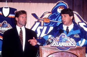
You’re taught in these historiography courses that history starts about 20 years ago. The Fisherman logo had been unveiled about 20 years before I embarked on this project: If it was something more recent, people might not be willing to talk about it, and we wouldn’t know how it turned out, or how it would be remembered. Once 20 years have passed, you have a good idea of the legacy. And for me it was good that it was just 20 years ago. So a lot of the people who were involved in the rebranding process were still alive, and they also were somewhat removed from the project, so they were willing to talk more freely and maybe be willing to criticize the people involved, whether it was the designers or Mike Milbury, the coach and general manager at the time.
Do you like the Fisherman jersey?
Kirk Muller wanted no part of it.
I never saw the problem with the logo itself. I do understand it looks a lot like the Gorton’s fisherman. It reminds me, and a lot of Islanders fans, of the 1990s. It has that look of the San Jose Sharks and Mighty Ducks logos that came out right before, and inspired the Fisherman logo. I’m drawn to the curiosity of it. This was a logo we can’t talk about, it is something that was around only for a couple of years and it was part of history that got whitewashed.
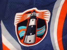
I also like the idea of what it represents. The Islanders don’t play in New York City: They wanted to differentiate themselves from the Rangers. There are distinctions between Long Island and New York. The ocean, the beach, the maritime culture, and the fishermen. And I like that with this jersey they were trying to do all of that. It wasn’t just the logo; it was the wavy numbers on the back that were supposed to represent ocean waves, and the lighthouse logo on the shoulder, which is one of my favorite logos ever. I wish they had made that the main crest.
I’m in agreement with you there. The Fisherman jersey in my mind has crossed the line in a way similar to the Mercury Mets jersey: The fans hated it so much they eventually became fond of it. It was so bad it was good.
Howie was there for both the reviled Islanders rebrand and the Mets one-night relocation to planet Mercury
There’s that same quality. Even if it was just one game, people remember the Mercury Mets because it was so bizarre. It reminds me of 1999, when I became a Mets fan, and that was a really great season for them. I vividly remember the Mercury Mets jersey because it was part of my initiation to Mets fandom. I vaguely remember Orel Hershiser wearing it. That’s the fondness people have for these things. If you look at it aesthetically, maybe if you’re a top-notch designer, you think this is silly. But if you’re going for a nostalgic point of a view and an emotional point of view, where I think fans are coming from, then you are going to be kinder to something that might not have been a Versace or Armani quality design.
The wavy numbers on the back of the jersey gave it an interesting look, but it interfered with the purpose of the jersey number which is to allow fans to identify players at a glance. Do you give much thought to the jersey numbers themselves? I thought it was interesting earlier this year when Lou Lamoriello unilaterally changed the jersey numbers of five or six players.
Lamoriello is known for wanting his players to wear low numbers. Josh Ho-Sang is one of the Islanders’ top players and had to change his number from 66 to 26. That caused a stir among a number of Islanders fans. As far as the waviness of the numbers on the jerseys, I didn’t give it a lot of thought. It just became another way for fans to mock the jersey. They could say, “it makes us seasick.”
“Seasick” numerology
It made for a disjointed look depending on what number you wore. If you have a number 1 and its bunched together in a wave, maybe it doesn’t look so bad, but if was a 6 or 9 or a number with contours to it, it made it weird on the back of the jersey.
To me I just embrace it all as part of this experiment. It was different. In my time as an Islander fan they’ve never done anything different with their main logo. There’s been some background changes and done different things with stripes, but they really haven’t done anything bold. And I like that with this jersey, they were really trying something different. OK, it failed, but I want to give them a little bit of credit for trying something. And I hate that because of this flop, the Islanders won’t do anything dramatic anymore. And it seems like they’re stuck with that one logo, and even their quote-unquote secondary logo is just pulling the ‘NY’ off the original logo.
Secondary logo that could have been primary
To me, the lighthouse is much more of Long Island type design. Whereas the Fisherman is something you might associate with parts of the Island, everybody on Long Island can relate to a lighthouse. Everybody goes to the beach and has seen them.
The Q&A you do with the designer in the book was interesting. He made a point that he doesn’t really like the classic Islanders logo.
I was startled by that, because for me and most Islander fans, that’s something sacrilegious. That’s what they wore when they won the Stanley Cup! That’s the logo that’s been there since the birth of franchise and I feel a real identity with it. I was an Islanders fan in Rangers country and had them knock me for it, so I became very loyal to it. I view it as a depiction of my identity as a fan.
But he said he didn’t like the lettering and other stuff, and the whole thing was a 1970s look. And the logo was done on short notice. Depending on which story you believe, it was about three days. Someone was told on a Thursday night we need to have a logo by Monday morning for a press conference. It was done before this modern era with focus groups and testing.
It goes to a larger point whether you make fun of the fisherman or the Nyisles the mascot or other aspects of the rebrand, it’s really all subjective. We might say this logo is clearly better, but is it really? The people I spoke to for the book who were pure design people all said the fisherman logo was better than the original Islanders logo. It’s all the memories coming to it though. It’s not all design 101.
It’s fairly obvious to me how closely the Islanders logo adheres to the same ideals as the Mets logo. It’s a circle, it’s the same colors, it’s representative of the area, whether its bridges or buildings or the island itself. One’s got baseball stitches and the other’s got a hockey stick.
So how did you get the book sold? One of the truisms in sports publishing is that books about teams that struggle don’t do all that well.
Hockey books in general don’t sell well, unless its riding a famous player. Wayne Gretzky can sell his book, but will Nick Hirshon sell his? Part of my feeling was this was a very colorful, interesting story. So my idea was let’s not just sell it to this small niche of Islanders fans who remember 1995 but I think you can be someone who never went to an Islanders game and still appreciate the zany stories about Mike Milbury spitting at his players and John Spano coming in posing as a billionaire who will pump all this money into the team but it turns out he’s a con artist. You don’t need to be a true hockey fan to appreciate that.
I tried to make that a part of a part of the pitch from the beginning, so it wasn’t like, I’m a guy from Long Island writing about my favorite team. What the publishers kept asking was, “What’s significant about this?’” So I really had to establish why I thought this was the worst sports branding failure ever, and if you look at everything, they went through more in 28 months than most teams go through in 28 years. I also think University presses in particular are kinder to sports titles that might not do very well in terms of sales, but are stories worth telling and are worth getting out in the market.
As someone who was not very well versed in Islander history I was shocked just based on your descriptions of Milbury that he lasted even one year. And it’s easy to make the connection that the wackiness of the branding initiative is a match for the dysfunction in the front office and ownership.
Milbury didn’t leave the team until 2007. And that’s kind of insane when you consider the comments he made to the media, the terrible trades, clashing with so many players he sent away or disparaged. It’s unbelievable that someone like that could last so long especially in the New York market which is associated with high rates of turnover.
I think it was a combination of factors. Part of it was being out on Long Island and away from the New York spotlight. A general manager of the Mets or the Yankees couldn’t get away with what Milbury did. It was also before social media where people couldn’t band together to build a movement like they can today on Twitter and Facebook. Also, the ownership kept changing so there was no way to hold someone like Mike Milbury to account. Every new owner felt obligated to give him a chance. He was a hockey lifer and he was very charming and persuasive.
Were you able to reach Milbury as part of your research?
I tried, but I got a no from NBC Sports, where he’s an analyst now. I tried every single person I could who was involved in the rebrand: every player, the coaches, broadcasters and designers. I feel like you owe it to people who might not be viewed positively in your work to have a say. And that went for everyone, John Spano, and Kirk Muller, who was traded to the Islanders but didn’t report. But everything I say about them were from primary sources—Newsday, the New York Times.
I heard you mention casually you’d be interested in a Mets book. What would you write about?
I don’t know. I’m still trying to get the promotion for this one done. And doing the book is so much work, so much intellectual energy doing the research and the interviews. It’s all very daunting. I might be interested in the 1999 season which was my first as a Mets fan, but there’s probably people who are out there who know this more than me or are already working on it.

 The Mets made it official, reserving July 9 for a pregame ceremony during which they will remove No. 17 from circulation to honor the World Champion first baseman, Gold Glove winner, New Yorker and broadcaster Keith Hernandez.
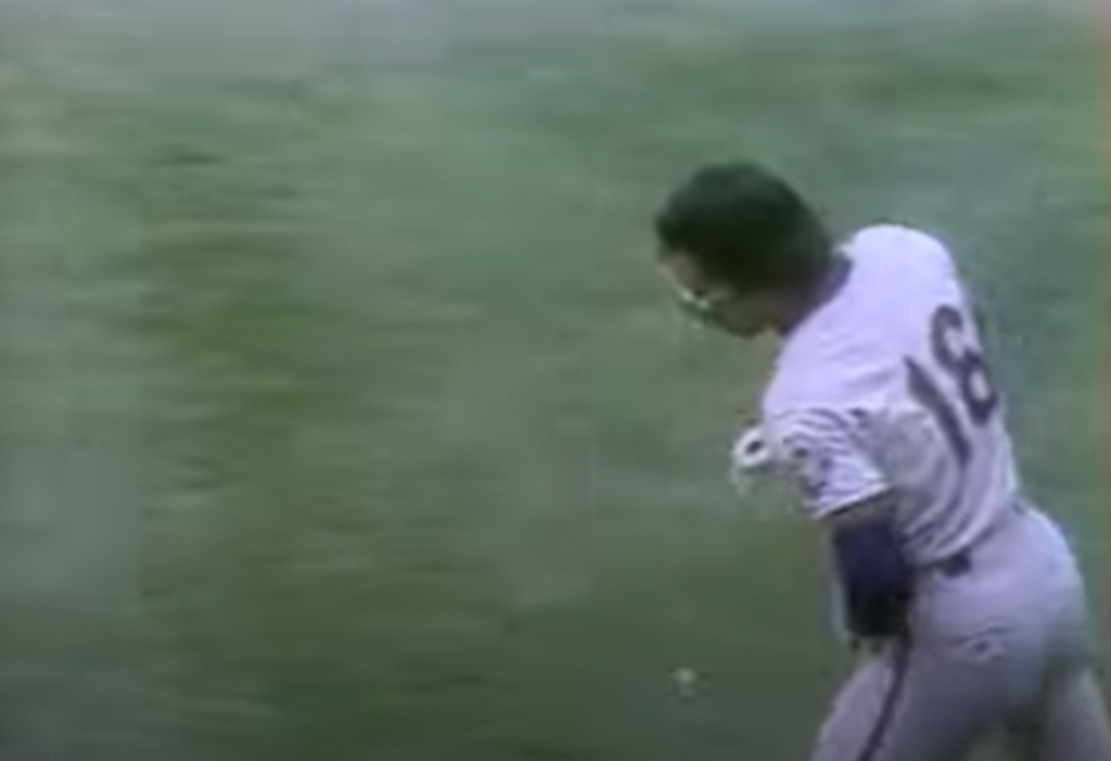
 Mo Vaughn taught the Mets–and all of baseball really — what it meant to be a big acquisition, and how to face the dying days of one’s career without exerting too much energy. In his honor, ballplayers throughout MLB will don No. 42 — the same digits found on the back of Vaughn’s 3XL jersey.
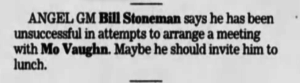 But an injury to his his massive biceps requiring surgery cost Vaughn the entire 2001 season, and combined with a deteriorating relationship with the Angels front office, became just the sort of deeply discounted damaged goods the Mets under Steve Phillips could not resist shopping for.
 Led by Big Mo, the totally new and yet older and fatter 2002 Mets were the kind of massive disappointment legends are made of. Two years after making the World Series the club slid to a 75-86, 5th-place finish (for which the club blamed the manager. Of course!). And with a 35-year-old Vaughn back in 2003 (at least until his knees gave way in May) the club crashed through the 90-loss barrier.
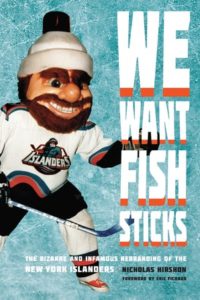 The Mets have had some uniform mishaps over the years, but nothing compared to the infamous Islanders rebrand of 1995, when the struggling hockey club abruptly cast away its classic logo and colors and reeled in an ocean motif highlighted by a cartoon fisherman crest.